
An Introduction to the Art of Composition
Hey there everyone, I’m Brandon Welch – one of the new 3D VFX tutors here at Escape Studios and I’m going to talk about Composition for a little bit in this here blog; as I’ve been reading a book which I use as a small primer for anything composition or colour wise.
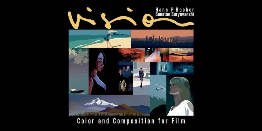
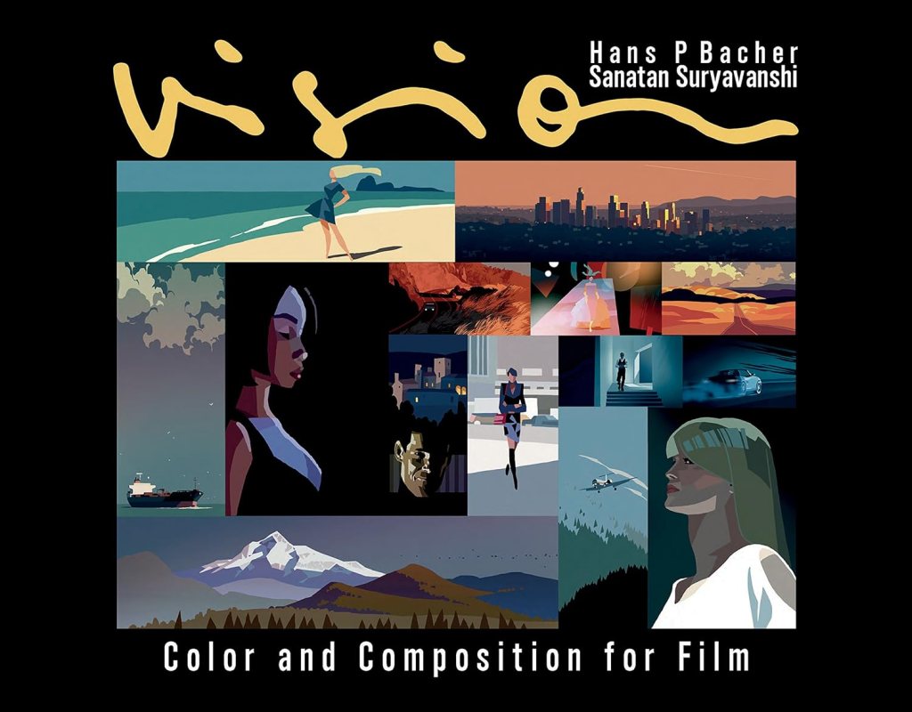
It’s called “Colour and Composition for film” by Hans P. Bacher and Sanatan Suryavanshi.
So if you’re a student I absolutely would pick this up and study it; it lays out what is quite a lengthy and deep topic very well and demonstrates the concepts and theory really clearly (as a book about composition should!)
So lets get into it!
What is Composition?
According to Oxford languages Composition is: “the nature of something’s ingredients or constituents; the way in which a whole or mixture is made up.”
For something out of a dictionary, that sounds quite poetic and is very apt.
A composition is the sum of it’s parts; individual pieces of a puzzle that only once complete make up an image.
This composition, this image – can be anything in theory but; what makes it good? – what makes it a well composed image or frame?
“A Well composed frame is one that is instantly readable, visually interesting and evokes the right mood…”
– Colour and composition for film
There it is, simply put.
It’s all about understanding what you should be looking at, being interested enough to keep looking at it and trying to get your audience to feel the emotions you want them to feel.
Composition is a deep topic; with lots of contributing elements like shape, colour, light, camera angle etc.
We could talk about it for weeks.
But Im just going to focus on the main three represented in that quote – Legibility, Visual Interest and Mood.
I feel these 3 are at the core of a good composition.
Legibility
Legibility; the ease at which we can understand or decode what we are seeing.
For an image to be effective, you need to see what’s happening and understand it.
This might seem incredibly obvious but there are many traps you can fall into as a creator – especcially if you’re trying to make something interesting or show off a particular effect or camera angle; or tell a particular part of the story that requires the character or hero be in a certain place.
But too often we forget as creators that the audience can’t read our minds; too often we see a shot where our characters might unintentionally bleed into the background or into shadow.
A particular prop or character is blocked by an ill-placed bush or pillar as the camera passes in front of it.
It’s an easy trap to fall into as creators; particularly in 3D or in Concept Art that we often get bogged down in the details and add intricate layer upon intricate layer to show off how cool this machine or character is, or our own modelling and design prowess.
But at the end of the day the audience will only spend about 5-10 seconds looking at a shot and they’ll need to understand everything you want to communicate to them in that short time frame.
Thus, it’s important to keep it simple…
A good composition will keep your eye focused in one or two places of your choosing – “your choosing” is the part I want to focus on here.
A skilled artist does things intentionally – happy accidents are sometimes welcome; but we’re not hired to create things by accident.
We’re hired because we know how to control an image; to control where someone looks and to communicate something to them in a few brief seconds.
If you’re a student reading this; ask yourself what you want the audience to be looking at and how you can best communicate that to them.
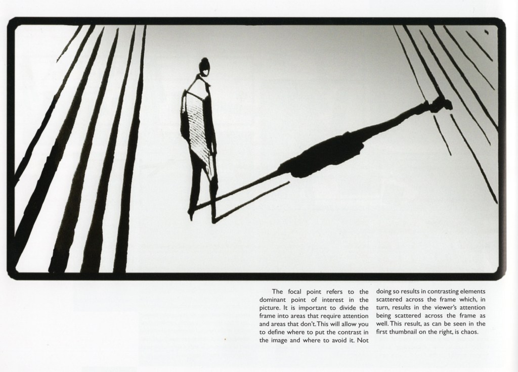
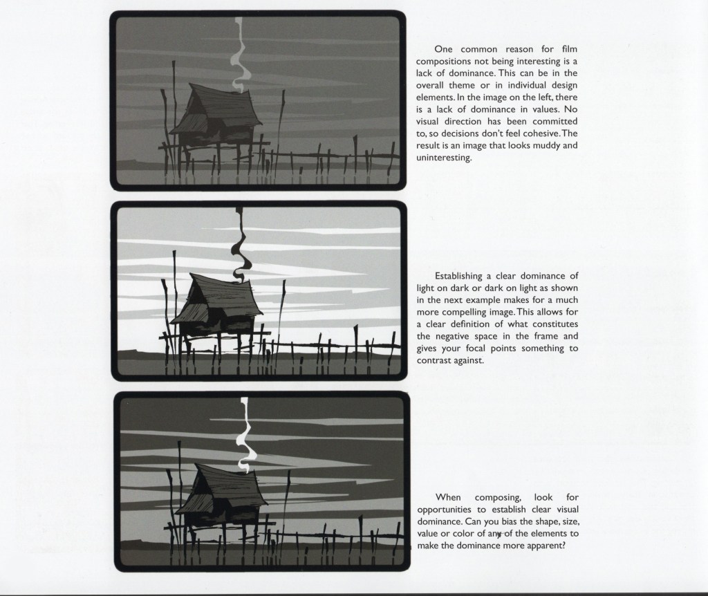
Ask yourself what is the dominant point of interest in the picture; dividing the frame into areas that require attention and areas that do not.
This will allow you to define where to put the contrast in your image because the eye is drawn to contrast.
Ask yourself “would a random layperson know whats going on if they looked at this image”.
This all said, we still need to convey atmosphere and emotion in our shots, sometimes we need to be deliberately ambiguous where some elements of the shot are intentionally obscured to create mystery or tension; the meaning of the shot could depend on that.
A low-key shot of a figure standing in the dark – a brief flicker of movement as a creature darts across the screen.
It’s ensuring that it’s done deliberately and that it’s not an accident, we do not want to be unclear with our intentions.
Poor placement or silhouette are easy ways to confuse your audience.
Visual Interest
“Variety is foundational to the human experience”
– Colour and Composition for film.
Stimulating your audience can be tricky – barraging your audience with wild and crazy shapes and colours can be exciting – but it can be overwhelming and unpleasant.
Your audience could even become numb to the amount of information being communicated to them.
Like how too many posters or signs in the same place often leads to people ignoring them as it blends into the background as visual noise.
At the same time we cant have everything look the same, that would be boring.
So it needs to be tempered, balanced and harmonious.
Variety in silhouette, size and distribution are easy ways to add a little bit of visual interest to a piece.
I myself am a fan of using assymetry in my designs; particularly in clothing or creature design.
But it’s also about visual dominance; sometimes trying to please everyone means you please no-one and thats true of any image.
It’s why we have a director; someone to take the helm and say “this is what we’re doing“.
Choose a clear direction for what you want to say and what you want the audience to look at.
Mood
We need to ensure the mood and tone of a scene is emotionally appropriate, think back to your favourite film – you probably remember the scene that played with your feelings the most; made you cry or laugh.
That’s not only down to good writing but the visual component as well.
“The important questions to ask yourself while designing emotionally appropriate compositions are: Are the individual elements doing their best to describe the mood? Are they all expressing the same type of mood or are they contradicting each other?
Is there a dominant mood in the image?
Is this the right mood for the shot?”
– Colour and Composition for film
Creating mood and atmosphere is a powerful thing and even the simplest shapes can have a profound effect.
This is basic shape language: Sharp shapes are dangerous or threatening, Square shapes are solid and represent stability and Round shapes are safer or more innocent.
This is Shape language 101, likely one of the first things you learn at any art school.
But it’s still so important – an art teacher I had several years ago once told me; “If the biggest, simplest shapes dont work then the smaller more detailed shapes wont either”.
So work with those simple lessons – a shot of a character framed by lots of jagged shapes is going to feel very different to one surrounded by lots of round ones.
Alot of this comes from nature and the world around us; that threatening feeling we get when looking at jagged shapes comes our associations around teeth and thorns and sharp rocks; likewise we associate softer shapes with more comforting things like pillows or bubbles and so on.
The point is – especcially if you’re a student – study and analyse the world around you.
Ask yourself how you feel in whatever environment you’re in and why you feel that way.
Visually – what is making you feel that way?
Compare how a cramped tube carriage looks compared to an empty one.
Likewise how does it feel to be in it?
What shapes do you associate with that feeling?
How can we break that feeling down to it’s biggest and simplest shapes?
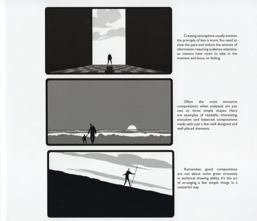
It’s that last thumbnail I want to hone in on; “Good compositions are not about some great virtuosity in technical drawing ability. It’s the art of arranging a few simple things in a masterful way”
It’s why Composition is one of the core fundamentals of any medium – you can be the greatest technical modeller or draftsperson on the internet but if you cant arrange an image in a deliberate or skillful way then all that technical skill is for nothing.
Arranging those shapes is just as important as how they look in the first place.
Going back to that cramped tube carriage example; we’d likely not use sharp jagged shapes in that example – it’s too dangerous for something as ordinary as the London Underground; we just want to communicate a feeling of discomfort not danger.
So we could use taller rounder or more square shapes?
Our main character surrounded on all sides by everyday commuters just trying to get home from work; the air stifled and the light bright and oppressive.
Colour is just as important in creating mood – but I think I might leave Colour for another blog, another day.
So there’s a couple basics of Composition; again this is a very deep and complex topic that we could talk about for hours but I dont want to end up rambling more than I have.
So do check out Colour and Composition for film; it’s an absolutely amazing book for any visual creator and all the images I’ve posted here come from that book and I hope you’ve gotten something out of this post.
Thank you for reading!
– Brandon
